The Art of Statistics: Learning from Data — A Practical Guide to Statistical Thinking


Introduction
Statistics is much more than calculating averages or producing attractive charts. It is a disciplined way of learning from data when information is incomplete, variable, or uncertain. For engineers, researchers, students, analysts, and professionals, statistical thinking provides a bridge between raw observations and defensible decisions.
Imagine an engineering team monitoring the temperature of a manufacturing machine. Hundreds of measurements may be collected every day. Looking at the individual readings can be overwhelming. Statistics helps transform those observations into useful questions:
- Is the machine operating normally?
- Is temperature increasing over time?
- Are unusual measurements random or meaningful?
- Does one production condition create more variability?
- Can the available data support a reliable prediction?
This is the central idea behind The Art of Statistics: Learning from Data: data becomes valuable when we learn how to ask the right questions of it.
Statistical thinking combines observation, probability, measurement, visualization, modelling, and critical reasoning. It is particularly important in engineering because real systems rarely behave exactly as theoretical models predict.

Whether you are studying mechanical engineering, civil engineering, electrical engineering, computer science, data science, or another technical discipline, statistics can help you distinguish a genuine pattern from random variation.
Background Theory
Why Statistics Matters
Every real-world measurement contains some degree of variation. Material properties differ, sensors have limitations, environmental conditions change, and human behaviour is inconsistent.
Statistics gives us tools for understanding this variation rather than simply ignoring it.
A useful statistical workflow often moves through several stages:
Observation → Data Collection → Cleaning → Exploration → Analysis → Interpretation → Decision
Each stage matters. Poor measurements can produce misleading conclusions even when the final statistical method is technically sophisticated.
Population and Sample
A population represents the complete group or system we want to understand.
For example, an engineer investigating the strength of a particular type of concrete may be interested in every batch produced by a facility.
Testing every possible specimen may be impractical. Instead, the engineer selects a sample and uses it to learn about the broader population.
This creates an important statistical challenge: the sample must provide useful information about the population.
Variation Is Information
Variation is not automatically an error.
Suppose two machines produce components with slightly different dimensions. The variation may reveal:
- normal manufacturing fluctuations,
- tool wear,
- environmental effects,
- measurement problems,
- material differences, or
- an underlying process change.
A skilled statistician does not immediately remove unusual observations. The first question is why the observation is unusual.
Definition
What Is Statistics?
Statistics is the systematic process of collecting, organising, analysing, interpreting, and communicating data to support understanding and decision-making under uncertainty.
Statistics can be divided into two broad areas.
Descriptive Statistics
Descriptive statistics summarise observed data.
Common examples include:
- Mean
- Median
- Mode
- Range
- Variance
- Standard deviation
- Percentiles
- Frequency distributions
- Charts and graphs
The purpose is to answer:
“What does the data we have look like?”
Inferential Statistics
Inferential statistics uses sample information to learn about a larger population.
It includes concepts such as:
- Sampling
- Confidence intervals
- Hypothesis testing
- Regression
- Correlation
- Probability models
- Statistical prediction
The central question becomes:
“What can this sample tell us about something larger?”
Statistical Thinking vs. Statistical Calculation
Knowing how to calculate a statistic is not the same as understanding statistics.
A spreadsheet can calculate an average instantly. The difficult part is determining whether the average is an appropriate summary.
For example, if a dataset contains a few extremely large observations, the mean may provide a distorted impression of the typical case. The median may better represent the centre.
Therefore, statistical expertise is largely about choosing appropriate methods and interpreting their meaning.
Step-by-Step Explanation: Learning from Data
Step 1: Define the Question
Start with a clear question.
Instead of asking:
“What does our dataset show?”
ask something specific such as:
“Has the failure rate of the production process changed since the maintenance procedure was introduced?”
A precise question determines what data should be collected and which analysis is appropriate.
Step 2: Identify the Data
Determine what variables are available.
An engineering dataset might include:
| Variable | Example Type | Possible Purpose |
|---|---|---|
| Temperature | Continuous | Monitor equipment |
| Pressure | Continuous | Detect operating changes |
| Material type | Categorical | Compare materials |
| Failure status | Categorical | Identify reliability |
| Production date | Time-based | Detect trends |
| Operator | Categorical | Investigate process variation |
Step 3: Collect Data Carefully
Data quality begins before statistical analysis.
Important considerations include:
- Measurement instruments
- Sampling frequency
- Sampling location
- Recording procedures
- Missing observations
- Human errors
- Environmental conditions
A sophisticated statistical model cannot magically repair systematically poor data.
Step 4: Clean the Dataset
Before analysing the data, inspect it for:
- Duplicate records
- Missing values
- Impossible measurements
- Incorrect units
- Typographical errors
- Inconsistent categories
- Extreme observations
Cleaning should be documented. Removing observations without a defensible reason can introduce bias.
Step 5: Explore the Data
Exploratory analysis helps reveal the structure of the dataset.
Useful tools include:
- Histograms
- Box plots
- Scatter plots
- Bar charts
- Line charts
- Frequency tables


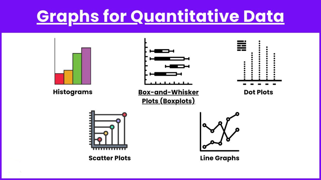

A histogram can reveal whether observations are concentrated around a particular region. A box plot can highlight differences between groups and potential outliers. A scatter plot can reveal relationships between two variables.
Step 6: Compare Groups
Suppose an engineering company tests two manufacturing processes.
Instead of simply comparing their averages, investigate:
- Centre
- Spread
- Distribution shape
- Outliers
- Sample size
- Measurement conditions
Two processes can have similar average performance while having dramatically different variability.
Step 7: Look for Relationships
Statistical analysis can identify associations between variables.
For example, an engineer might examine whether:
- temperature changes alongside vibration,
- production speed is associated with defect frequency,
- rainfall relates to structural monitoring measurements,
- power consumption changes with equipment load.
A relationship does not automatically mean that one variable causes the other.
Step 8: Communicate the Finding
The final result should be understandable to the intended audience.
A technical report might contain statistical details, while an executive presentation may need only the most important findings, limitations, and recommended action.
Good statistics is therefore partly an exercise in communication.
Comparison: Descriptive and Inferential Statistics
| Feature | Descriptive Statistics | Inferential Statistics |
|---|---|---|
| Main purpose | Summarise observed data | Learn about a broader population |
| Typical tools | Mean, median, charts | Confidence intervals, tests, models |
| Focus | What happened in the dataset | What may be true beyond the dataset |
| Uncertainty | Usually limited to description | Central to interpretation |
| Example | Summarising machine temperatures | Estimating future machine behaviour |
Mean vs. Median
The mean is useful when values are reasonably balanced and extreme observations do not dominate.
The median identifies the middle position after ordering observations.
For skewed datasets, the median can sometimes provide a more representative description of a typical observation.
Correlation vs. Causation
Correlation describes an association between variables.
Causation means that changing one factor contributes to a change in another.
This distinction is one of the most important principles in statistical reasoning.
If two engineering variables increase together, that observation alone does not prove that one caused the other.
Diagrams and Tables for Statistical Thinking
The Statistical Learning Cycle
A simple conceptual diagram is:
Question
↓
Collect Data
↓
Clean & Validate
↓
Explore
↓
Analyse
↓
Interpret
↓
Communicate
↓
Make a Decision
↓
Ask a Better Question
This cycle emphasizes that statistical analysis is iterative rather than a one-time calculation.
Choosing a Visualization
| Data Question | Useful Visualization |
|---|---|
| How are values distributed? | Histogram |
| Are there extreme observations? | Box plot |
| How do categories compare? | Bar chart |
| How does a measurement change over time? | Line chart |
| Are two variables associated? | Scatter plot |
| What percentage belongs to each category? | Carefully designed proportion chart |
| How do multiple groups differ? | Box plots or grouped charts |
A visualization should answer a question rather than merely decorate a report.
Examples
Example 1: Manufacturing Quality
A factory records measurements from components produced during several shifts.
The first analysis shows that the average dimensions are acceptable. However, a distribution chart reveals that the night shift produces a much wider range of dimensions.
The engineering team investigates the process and discovers that a calibration procedure is being performed inconsistently.
The statistical insight was not simply that the average was acceptable. The variation contained the important information.
Example 2: Structural Engineering
Engineers monitor vibration levels in a bridge.
Most readings remain within the expected range, but several unusual measurements occur during periods of heavy traffic.
Rather than immediately declaring a structural problem, engineers investigate traffic conditions, sensor performance, environmental factors, and historical measurements.
Statistics helps determine whether the unusual observations represent random variation or a meaningful change.
Example 3: Energy Management
A commercial building collects electricity consumption data.
Analysis shows that energy use is consistently higher during particular operating periods.
The engineering team compares occupancy, HVAC operation, weather conditions, and equipment schedules.
The resulting statistical analysis supports an energy-efficiency strategy rather than relying on assumptions.
Real-World Applications
Engineering and Manufacturing
Statistical methods are fundamental to quality control, reliability engineering, process optimisation, and experimental design.
Engineers use data to monitor production consistency and identify process changes.
Civil Engineering
Statistics can support:
- Material testing
- Structural monitoring
- Traffic analysis
- Construction quality control
- Environmental assessment
- Risk evaluation
Mechanical Engineering
Applications include:
- Machine-condition monitoring
- Reliability analysis
- Failure investigation
- Experimental testing
- Manufacturing optimisation
Electrical Engineering
Statistical analysis can help investigate:
- Power demand
- Signal behaviour
- System reliability
- Sensor data
- Equipment faults
- Energy consumption
Data Science and Artificial Intelligence
Modern machine-learning systems depend heavily on statistical thinking.
Data scientists must understand:
- Sampling bias
- Data distributions
- Model uncertainty
- Overfitting
- Validation
- Correlation
- Prediction errors
A machine-learning model can be technically impressive while still producing poor decisions if the underlying data is biased or poorly collected.
Business and Public Policy
Statistics is also used for forecasting, customer research, economic analysis, risk management, healthcare planning, transportation, and public-sector decision-making.
Interactive educational and institutional dashboards demonstrate how statistical summaries can be converted into accessible visual information for decision-makers.
Common Mistakes
Mistake 1: Trusting the Average Automatically
An average can hide important differences.
Solution: Examine the distribution and variability as well.
Mistake 2: Treating Correlation as Causation
Two variables moving together does not establish a cause-and-effect relationship.
Solution: Consider experimental design, alternative explanations, and relevant background knowledge.
Mistake 3: Ignoring Outliers
An unusual observation may be a measurement error—or it may be the most important observation in the dataset.
Solution: Investigate unusual values before deciding what to do with them.
Mistake 4: Using an Inappropriate Chart
A technically correct chart can still communicate poorly.
Solution: Select visualisations based on the question and audience.
Mistake 5: Overinterpreting Small Samples
A small sample can produce unstable conclusions.
Solution: Consider sample size, uncertainty, sampling design, and replication.
Mistake 6: Confusing Precision with Accuracy
A measurement system may repeatedly produce nearly identical readings while still being systematically wrong.
Solution: Evaluate both measurement consistency and closeness to the intended reference.
Challenges & Solutions
| Challenge | Why It Matters | Practical Solution |
|---|---|---|
| Missing data | Can distort analysis | Investigate why values are missing |
| Measurement error | Can create false patterns | Validate instruments and procedures |
| Sampling bias | Sample may not represent population | Improve sampling design |
| Outliers | May strongly influence conclusions | Investigate their origin |
| Confounding variables | Can create misleading relationships | Consider alternative explanations |
| Poor visualisation | Can hide important patterns | Match chart to analytical question |
| Overfitting | Model may perform poorly on new data | Use appropriate validation |
| Miscommunication | Correct results may be misunderstood | Explain findings in context |
Case Study: Improving a Manufacturing Process
Consider a fictional manufacturing facility producing precision mechanical components.
The quality department notices that customer complaints have increased slightly. Management initially suspects that the entire production process has deteriorated.
Instead of immediately changing the equipment, the engineering team begins a statistical investigation.
Stage 1: Data Collection
The team gathers production measurements from several weeks and records:
- Production date
- Machine identification
- Product type
- Operating conditions
- Inspection results
- Failure classification
Stage 2: Exploration
The overall defect rate appears moderate.
However, when the engineers separate the data by machine, one machine shows substantially greater variability.
Stage 3: Investigation
The team examines maintenance records and discovers that the machine recently received a replacement component.
The statistical evidence does not automatically prove that the replacement caused the problem. However, it provides a strong direction for further engineering investigation.
Stage 4: Validation
Additional inspections are performed under controlled conditions.
The engineering team identifies inconsistent calibration as the primary contributor.
Stage 5: Action
After calibration procedures are standardised, subsequent measurements show improved consistency.
The important lesson is that statistics did not replace engineering expertise.
Statistics helped engineers ask better questions and locate where engineering expertise should be applied.
Essential Tips for Learning Statistics
Start With Questions, Not Formulas
Before selecting a statistical method, define the problem.
Ask:
What am I trying to understand?
What decision will this analysis support?
Visualise Before Modelling
A simple chart can reveal patterns that a complicated model might obscure.
Understand Your Data
Know where the data came from, how it was measured, and what each variable represents.
Examine Variation
Do not focus exclusively on averages.
Spread, distribution shape, and unusual observations can contain valuable engineering information.
Keep Uncertainty Visible
A statistical conclusion is rarely absolute.
Communicate uncertainty rather than presenting estimates as unquestionable facts.
Separate Evidence From Assumptions
Clearly distinguish:
What the data demonstrates
from
What you believe the data might mean.
Document Every Decision
Record how observations were filtered, transformed, classified, or excluded.
This makes an analysis reproducible and easier to audit.
Use Statistics With Domain Knowledge
Statistics is strongest when combined with engineering knowledge.
A statistical pattern should trigger investigation, not replace scientific reasoning.
FAQs
What is the main purpose of statistics?
The main purpose is to extract useful information from data while recognising variation and uncertainty. Statistics supports better understanding, prediction, comparison, and decision-making.
Is statistics important for engineering students?
Yes. Engineering involves measurements, experiments, reliability, quality control, modelling, optimisation, and uncertainty. Statistical knowledge helps students interpret these activities more effectively.
What is the difference between statistics and data science?
Statistics provides many of the foundational methods for understanding uncertainty, relationships, samples, and populations. Data science combines statistical thinking with programming, databases, machine learning, visualisation, and computational methods.
Why are graphs important in statistics?
Graphs make patterns easier to see. They can reveal trends, clusters, unusual observations, skewed distributions, and relationships that may be difficult to recognise from tables alone.
Are outliers always bad?
No. An outlier can represent an error, but it can also indicate a genuine and important event. Engineers should investigate an unusual observation before removing it.
Can statistics prove something is true?
Statistical analysis generally provides evidence rather than absolute certainty. The strength of the conclusion depends on the data, sampling process, assumptions, study design, and analytical method.
Should beginners learn equations first?
Not necessarily. Beginners often benefit from learning statistical concepts and interpretation first. Once the ideas are understood, equations and computational techniques become easier to understand.
How is statistics used with artificial intelligence?
Statistics supports data preparation, model evaluation, uncertainty analysis, experimentation, sampling, feature analysis, and interpretation of machine-learning results.
Conclusion
The art of statistics is the art of learning from evidence. 📊
For engineers and technical professionals, statistics is not simply a collection of formulas. It is a way of thinking about variation, uncertainty, evidence, and decisions.
The most valuable statistical skill is not memorising every statistical technique. It is learning to ask better questions:
🔹 Is the data reliable?
🔹 Does the sample represent the problem?
🚀 What does the distribution reveal?
🔹 Is the apparent pattern genuine?
🔹 Could another explanation exist?
🚀 How certain is the conclusion?
🔹 What decision should follow from the evidence?
From manufacturing floors and construction sites to energy systems, laboratories, financial models, artificial intelligence, and public infrastructure, statistical thinking turns observations into knowledge.
The strongest analysts therefore do not merely calculate statistics.
They question the data, investigate variation, recognise uncertainty, communicate evidence clearly, and use statistical insight to make better decisions. 🚀📈
That is the real art of statistics.